
By Christina Bruce, originally published in the January-February issue of Portfolio Magazine
Just as with New Year’s resolutions, the new year for interior design means that we see an attempt to rid ourselves of the bad habits from yesterday and look towards fresh ideas. While I’m not suggesting you need to set fire to anything you own that was a part of the “out” trends from year’s past, I think it’s always good to know what is on the horizon.
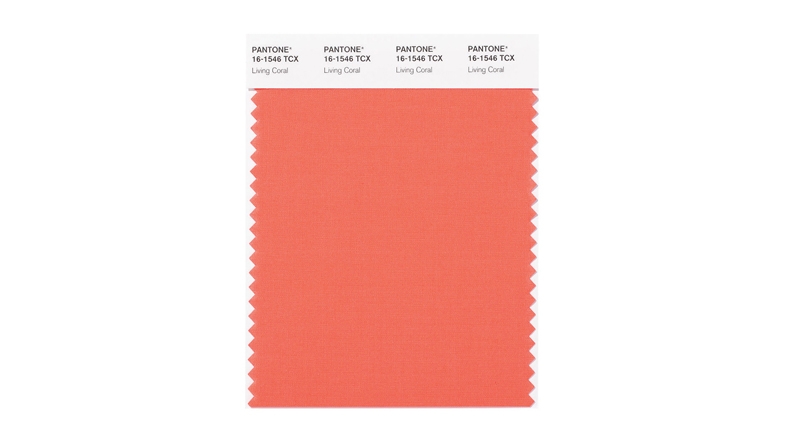
Last year to color experts at Pantone named “Ultra Violet” the color of the year for 2018. Pantone, who take color very seriously, described this purple as representing “the mysteries of the cosmos and the discoveries beyond where we are now”. I feel like that’s a lot of pressure to put on a color and, if I’m being honest, would describe it as very similar to the color of grape soda. For 2019 they announced, “Living Coral” as this year’s color. Well in Florida coral has been living large for years as a great accent color. This coral, however, is a much more saturated than the pastel version we often see. I think it would be great as small pops of color in a light, neutral scheme. So try it in accent pillows or accessories to update your space.
In the world of furniture, the American midcentury revival has lasted what feels like a century. While the sleek lines of the storage pieces are great to mix into most designs, the use of it head to toe is a bit thematic and makes me feel like I’m on the set of Mad Men. In 2019 we are seeing the introduction of Italian Mid-century which is very different than its American cousin. It involves curved furniture, delicate lines, and bold colors. The company CB2, owned by the popular Crate and Barrel, has come out with a line that gives a nod to this movement and would be a great way to inexpensively mix in some new pieces to your existing design.
In 2018 the interior design world also seemed to suddenly discover the color “cool grey”. While not an entirely new concept, it became so popular as a wall color that the warm beiges and taupes of yesteryear seemed nearly as dated as your grandmother’s avocado refrigerator. This year the idea of subtle white walls is in the forecast. This is a trend I can definitely get behind as white walls are classic and less likely to fall out of favor like our dear friend taupe. For more ideas on the best whites to use please read my article in next month’s edition entitled “Which
White is Right”.